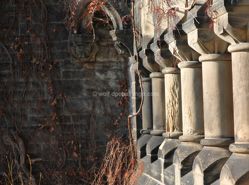
The frame is slightly tilted. This looks accidental and not intentional. The strong leading lines on the right should bring the viewers eyes to the main subject of the image. Good color and texture in the vines on the left.
I love the patterns of the pillars and wish I could see more of it. I think it would have worked better without so much empty space on the left and more pillars. Perhaps a portrait crop?
Could have used a CW rotate to the right a little - maybe 1.5 degrees. Was the focal point supposed to be the column in the middle? If so, a wider aperture should have been used depending on the lens to help isolate the back wall more. No vote, I'm in this one.





 Add photograph to your favorites
 Add photographer to your favorites

 Photographer found comment helpful.


