Composition:
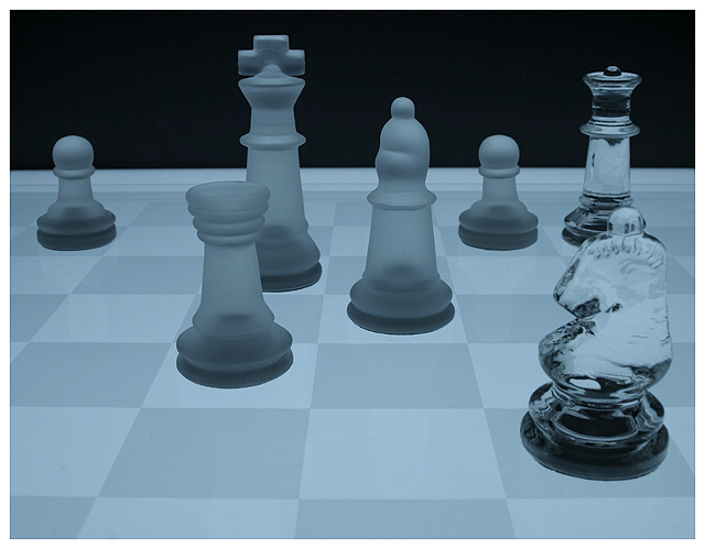
This is a superb composition. The horizontal lines are straight, (crooked is highly distracting of course) The contrast is superb. The black background makes you focus on the chess board, which is where the focus belongs.
The big choice of course is which piece to take, it's fairly self explanitory, save the subtle "best possible" move. This is shown by everyone's comments, which were extremely varied on what to take :) My only complaint is whose turn it is, but that is virtually impossible to show in this context, so no worries there.
Lighting:
The lighting you used looks like it comes from beneath, leaving all pieces glowing (I'm guessing this based on your 'light box' comment). It works very well for this photo.
Techincal:
No problems with your focus etc. At f/16 all pieces are in focus, good for a photo such as this. Your crop leaves enough room on every side to be comfortable, not cramped or unbalanced. Your exposure is good, save a little on the dark side, a little more light or less aperature would've added more contrast on the light side of the spectrum.
Post-processing:
Your border helps this photo. Not sure what you did to the photo regards editing, but whatever it was it's natural enough to not show. Again the light side of the spectrum could've been fine tuned in editing if you didn't want to re-shoot.
Overall:
Nice choice for this theme. Your composition is natural. I'd prefer your lighting be a tad brighter, but it suits this photo good enough. Really the lighting is my only recommendation for 'improving' the photo. Nice work.
And some of you need to hone your chess skills. ;)
Not a real choice here... I'm sure I'm not the only one who noticed, but I have to say it: Queen takes bishop... there :)
Abt the picture, nothing to complain about, maybe a little bit more contrast
A really great shot! It clearly meets the challenge and it does that even without help of the title. IMO it is the best entry in this challenge. I'd be very surprised if it did not ribbon. 10!
I hope people who don't know the rules of chess don't miss the point here. It's a nice photo. Doesn't really "do it" for me, but technically very nice, and a clever idea.
aside from the fact that this is a chessboard and this horse has been beaten into a bloody twitching pulp, this photo has magnificent colors and it would be a shame if it did not place in the top 1-2 or 3. depending on whos move it is, the smoked glass is really not in a bad situtaion, but there are too many potential takes on the board so I will give you a nine, taking away one point for your lack of attention to detail, for if you are not a chess player than shame on you- and if you are, shame on you for sacrificing form for substance. in simpler terms, way to go!





 Add photograph to your favorites
 Add photographer to your favorites

 Photographer found comment helpful.


