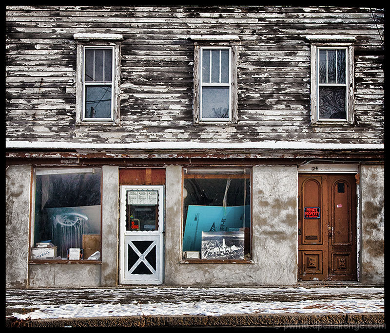
by the angle/distorsion, it looks like your line of sight between you and the building was not 90 degrees... that's why the top and bottom of the pic are both tilted in opposite directions (i.e. rotating the pic would not fix this shot)
next time, make sure your line of sight between your camera and the wall is a perfect 90 degree angle, this will eliminate this problem,
This is such an interseting composition. I love the stark difference between the top level and bottom level. I guess because the top is b/w and bottom in color, the top is symetrical and simple, bottom chaotic and ouit of balance. Well anyway, I really like it. Great eye.
Focus might have been a bit off. The "Private Property" sign's lettering is blending together. And the upper wood paneling seems a bit fuzzy. No vote, I'm in this one.
Feels really flat. I suspect you intended that, but it's just a really "flat" feeling. Seems purely documentary, with no context or feeling involved at all.





 Add photograph to your favorites
 Add photographer to your favorites


 Photographer found comment helpful.


