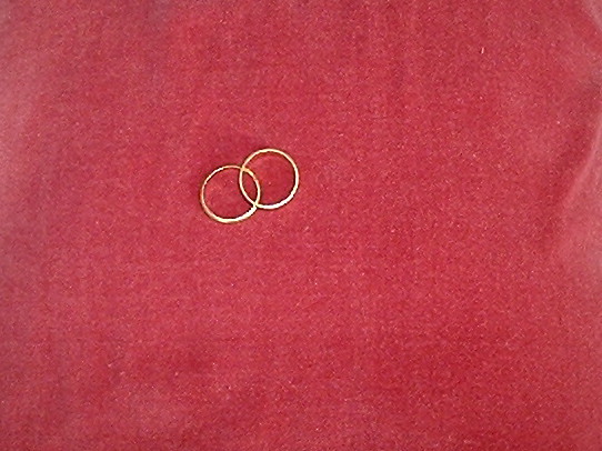
I like the simplicty of this image. I think if the backgroud material was a little tidier it would emphasize the rings more. The colour works well though. Also the focus could maybe be a little sharper.
As a photo this does not have much interest. A closer view of the rings might have helped. The wrinkle on the right hand side is also a bit distracting. It also looks like your resizing of the image added some jaggies to the image.
nice concept. I feel like the shot could've been pulled off better. The red sheet is very dirty, and the rings don't "pop" off the page, they seem out of focus.






 Add photograph to your favorites
 Add photographer to your favorites


 Photographer found comment helpful.


