Author Thread
Post actions
Original picture:
Comments Made During the Challenge
Post actions
this would be a really neat stock photo
Post actions
This is one one my highest scores - but I'm having difficulty justifying it. I like it a lot, but just can't quite put my finger on why.
Post actions
Does it all taste the same?
Post actions
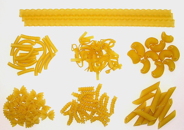
I really like the use of light in this image. The harsh light and lack of shadows emphasizes the only difference between the types of pasta: The Shape. My only suggestion would be that you could really go to town on the placement making it more formal and evenly spaced to really emphasize the lighting and composition. It is really powerful how you have made such a stark impact with such an everyday subject matter.
Post actions
Nice lighting on this one. It looks like it was slightly oversharpened.
Post actions
This is really nice. Good work reducing the shadows here - are the product on a light box/table?
Post actions
I saw a picture just like this a few years ago from a different person. I am wondering if you got the idea from that.
Post actions
composition is a little too symetrical to really work as a powerful still life, in my opinion.
Post actions
Nice, the background is too blown out for my taste.
Post actions
Lighting is too harsh, also looks a bit oversharpened. Idea is nice.
Post actions
Very good. Only minor problems are the pinkish color near the bottom/corners and oversharpening
Post actions
Looks like an intriguing advertisement, but doesn't say "choice" to me.
Post actions
Post actions
The backlighting is a little too bright and overpowering..good idea and still a good execution.
Post actions
pretty good - I find the light a little boring, but I like the composition.
Post actions
I always having this choice as well - it gets worse if two people decide!! Nice composition as well.
Post actions
This is great, looks like a piece of abstract artwork. Outstanding, 10






 Add photograph to your favorites
 Add photographer to your favorites


 Photographer found comment helpful.


