Yeah. I really like this picture. Alot. But it just can't hold a candle to second place. I think the background needs some work. And maybe the face. Not enough separation. Very good idea though.
Yeah. I really like this picture. Alot. But it just can't hold a candle to second place. I think the background needs some work. And maybe the face. Not enough separation. Very good idea though.
I have to agree. I can't see how this photo could have won a ribbon. It's just. . . well . . .it's just not good. sorry. All the faults have already been listed.
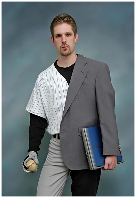
I also voted 10 on this photo. Yes I must agree there were several great photos in this contest with diverse emotion. I voted then went back and reviewed my votes, (all 270+); to make sure I was fair to everyone that entered. I guess everyone has his or her own opinion but this photo jumped out at me from the beginning. The word Choices was plastered all across the photo. So to me it met the challenge. After voting I went back and seen if my opinion of the photo was the same after reviewing all other photos. At that time I seen subtleties that really made me raise my vote from a 9 to a 10. Career or Dream! A choice that most all of us had to make; you know the choice you would made it you could. I liked the way the subject was grasping the ball, as if grasping for his dream. And it seemed as if the laptop was weighing him down, as if stuck in a boring career. Just my opinion, Great Photo and a well deserved ribbon.
I kinda like this photo alot! I'm one of those 32 voters that gave a 10! photo composition and lighting were excellent....the idea were great too! i mean...it project a person having to choose between his dream and career (or reality i would say!) which some of us have encounter.....having to sacrifice your dream and aspiration and pursue a "stable (sometime boring) career"!! Once again, congratulation.....you deserved the ribbon! :)
Everyone is so kind. It's a good thing. But sometimes it's good to be honest. Compare first palce to second place. It just doesn't make much sense. Not attacking the blue ribbon winner. so hopefully I don't get the usual dribbling flames. Just take a good look. Not sure what to make of the winning shot. It's a good idea, and it fits the challenge perfectly. But is it a good photograph? What do people base ratings on? The degree to which the photo meets the challenge? Technical details? Aesthetics? all-of-the-above? I hate to post this here, b/c you won fair and square. I congratulate you on the ribbon, you should be proud. But people on this forum are almost disgustingly "sweet". Stop with the sycophantic panting and consider what is being said. To say this shot is great or awsome is, well. . . Congrats on the ribbon, really. Sorry to post this during your parade.
Can some please tell how or why his picture is the winner? I give this a 1 and is not even showing I read some of the comments but they dont really make sense. Are this contest more like Title contest or pictures contest? I have to Admit a title is important for any composition but please...c'mon this pic got nothing to me. but anyway I have to congratulate aaron532 for the ribbon... work pays.
Things I notice:
Poor Background
The model should it have a half of a baseball hat to complete the idea.
I saw this kind of idea on different pics a TV comercial is not very original.
I didn't vote, but I would have personally given it an 8. Although this picture may not have brought out the emotions in some people, it brought out the emotions in a lot of people. Lighting is right on, without anything over- or underexposed. When I first look at it, I immediatly felt the mixed emotions of humour, sense of past, and achievement. Expression? I didn't mind it, b/c there's feeling in it (although it doesn't seem positive ;). Some people may have given it a 1 b/c it doesn't mean anything to them. But "half a baseball cap"? Give me a break. From a holistic standpoint, w/o all the nitty-gritty distractions, you deserved the ribbon.
Aaron:
Thank-you for your post on my entry. You are a true gentleman!
Your picture was extremely deserving and well done. An interested group of talented and competent photographers say so!
Keep in mind that most of those voters who selected you as a 1st place finisher were in competition AGAINST you which makes winning even more sweet and meaningful.
Be proud of your achievment and don't let dissenters ruin it for you.
Again, a most deserving win. You put in a lot of hard work.
Aaron, I said during the challenge this was my top pick for the ribbon, and look at that -- you won. It's a fantastic interpretation of the challange and you deserve your placement. I don't quite know the right words to describe how awful I feel that there are those who would post such bitter, negative, insensitive, thoughtless, and shallow comments as I've seen below on your winning image. If people have to be petty, there are forums for that. But to stain your ribbon with this dribbel is infuriating to me. Every time you pull up your winning picture to enjoy your victory, you have to see that junk. Please know that you won, fair and square, well deserve your victory, and the VAST majority of us on this site are proud of this image and your work.
Can some please tell how or why his picture is the winner? I give this a 1 and is not even showing I read some of the comments but they dont really make sense. Are this contest more like Title contest or pictures contest? I have to Admit a title is important for any composition but please...c'mon this pic got nothing to me. but anyway I have to congratulate aaron532 for the ribbon... work pays.
Things I notice:
Poor Background
The model should it have a half of a baseball hat to complete the idea.
I saw this kind of idea on different pics a TV comercial is not very original.
people are entitled to their opinions, you have yours, and we have ours. he deserves the ribbon, it has alot of emotion and the picture invokes a feeling of having to make a choice without a title. most people have thought about a dream career before.
You are right people are entitled to their emotion,that is why you were able to reply me, but see this a PHOTO contest and we suppose to choose the best or at least the most well taked picture and there was really nice pictures representing choices. I dont have anything against this pic though, is just to me is not the #1.
P.S: If you are working in a picture on a studio just make sure all the details are cover for your presentation. if you tell me this shot was taked just because it was your lucky day them I will consider my vote diferenly regardless of the mistake on the picture.
Peace
I have to agree. I can't see how this photo could have won a ribbon. It's just. . . well . . .it's just not good. sorry. All the faults have already been listed.
Congrats on the ribbon, but I have to agree to a point with abreul, I think this looks like a senior portrait, albeit a wierd one, and doesn't evoke any sense of choice for me. To me it looks static and contrived, whereas the second place shot evokes a truly powerful sense of choice even without a title.
Can any of the voters explain why they voted the way they did on this? I must be missing something. I didn't vote on this one, but it doesn't look like my vote would have made a difference here.
Can some please tell how or why his picture is the winner? I give this a 1 and is not even showing I read some of the comments but they dont really make sense. Are this contest more like Title contest or pictures contest? I have to Admit a title is important for any composition but please...c'mon this pic got nothing to me. but anyway I have to congratulate aaron532 for the ribbon... work pays.
Things I notice:
Poor Background
The model should it have a half of a baseball hat to complete the idea.
I saw this kind of idea on different pics a TV comercial is not very original.
people are entitled to their opinions, you have yours, and we have ours. he deserves the ribbon, it has alot of emotion and the picture invokes a feeling of having to make a choice without a title. most people have thought about a dream career before.
Congratulations. This was my top choice in this challenge. You did an excellent job of coming up with an interesting concept and photographing it well. Ann
Can some please tell how or why his picture is the winner? I give this a 1 and is not even showing I read some of the comments but they dont really make sense. Are this contest more like Title contest or pictures contest? I have to Admit a title is important for any composition but please...c'mon this pic got nothing to me. but anyway I have to congratulate aaron532 for the ribbon... work pays.
Things I notice:
Poor Background
The model should it have a half of a baseball hat to complete the idea.
I saw this kind of idea on different pics a TV comercial is not very original.
~COMMENTS FROM THE PHOTOGRAPHER~
Sorry for not placing this in the "Photographers Comments" I was planning on doing that before the challenge started but I ran out of time.
Well, I certainly didn’t expect to get the blue ribbon! I was aiming for a 6.0+ score and maybe a top ten finish. Thank you all for the great comments! Some were really helpful, plus it’s nice to hear praises!
Anyway, as many of you guessed, a lot of thought went into this shot. The idea was the easy part, making it happen was a bit of a challenge. I started with the baseball uniform, which I bought at the local Big5 store for about $25. Next the dress pants which I held up with the belt going through both sets of pants. I tucked the extra leg into the back of my belt. The jacket was next, with the rest just hanging down in the back. With a few of my test shots it was hanging a little to low so I tucked it into the belt too.
As for the props, I started with a baseball bat and a briefcase, but they looked to awkward so I went with the smaller ball and computer. I think they worked much better!
The hardest part of this whole setup was the background. I spent three days trying to come up with something that went well with both “halves”. I didn’t, so I just used our studio setup at work with a pretty generic color.
Post Processing: Pretty simple really, its nice being able to control everything in a studio setup!
-Minor Levels Adjustment
~Run though Neat Image
-Cropped
-Sharpened
-Added Border
Sorry for the long-winded comments! I get carried away late at night.
Again, thanks for the comments and the votes! I hope to do this well again in the future!
Colors are a bit flat, and the suit jacket rides a bit too far to the left. However this is still my favorite in the challenge, great choice of subject, well executed. If you had gotten rid of the blue in the laptop or used it again in the uniformor as the batting glove it could have been a bit better balanced, but a very good shot anyway.
Very inventive. The subject looks a bit awkward, but then anyone wearing half-clothing on both sides would be likely to feel a little odd! Good choice of using a standard studio portrait-type background.
Since this is one of my very top scores - I thought I'd try to give you my best shot at constructive comments.
First - let's talk technical: Exposure = perfect, composition = classic but effective, DoF = perfect.
On the artistic side: Idea = stunning, model = wonderful, background = a bit "commercial" for me, border = un-needed
Make it better by: 1) A logo on the baseball shirt (doesn't matter what it is - just something for the added impact) 2) No glove on the baseball hand - they don't use them.
Overall: I will be extremely surprised if you don't end up with a ribbon.
Very clever, creative. My pick for Best in Show. Didn't fancy the model's facial expression, however. Too serious or something. But great shot nonetheless...
Great concept and well executed. Good expression and pose, with nice lighting making this very effective. Perhaps a darker suit would have added to the contrast (the jacket and pants on the suit side don't really match). Good work though.
This is technically a very good image, and the idea is great as well.. The backdrop is a little too close to the model, or possibly could have done with some lighting to bring out the shadows behind him..
This one catches my eye from emotional and composition perspectives. The focus is perfect, the colors are well done and the positioning of the right leg forward is suggestive of wanting to choose the sport.
there is nothing really wrong with this picture, but somehow it doesn't make me go "wow". Maybe because it lacks all spontanity (or whatever it's called)





 Dreams vs. Career
 Add photograph to your favorites
 Add photographer to your favorites


 Photographer found comment helpful.


