Here is my personal scoring scale with 2 points each. The idea behind is to justify the score I gave. You have all right not to agree with it. This is just my personal opinion with whatever little photography knowledge I have. Hope it helps.
- Meets the challenge - 2 out of 2
- Lighting/Exposure - 1 out of 2
- Composition - 1 out of 2
- Concept and execution - 1 out of 2
- Over all image, WOW factor - 1 out of 2
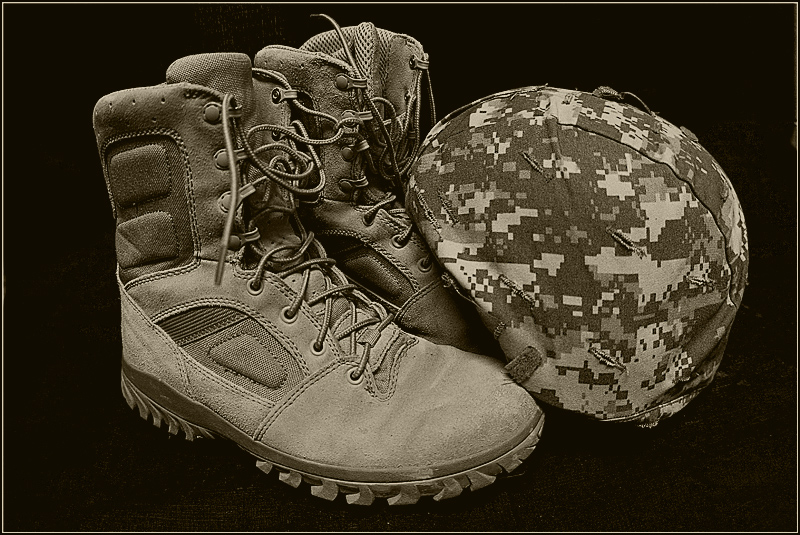
I like the shot, don't care for the sepia treatment, however. Somehow it does not seem appropriate for modern combat gear. An intense, contrasty b/w would work better with me for this subject.
Whilst i don't agree with the propaganda of the title, the image is a good effective simple composition that works well. The uniform tone is also good.
this is a good idea...but for me it is dull in tone...I have recently found out that if I am turning a picture to B&W or sepia...that if I push the hue/saturation before I convert it it really richens up the tones
Great lighting and tawny colours. But they are too shiny and new so that soldier is pushing a pen at a desk? The right shoe (our left) has a lace which could have been tucked away or placed closer to the shoe. It is heavily OOF and detracts.






 Add photograph to your favorites
 Add photographer to your favorites


 Photographer found comment helpful.


