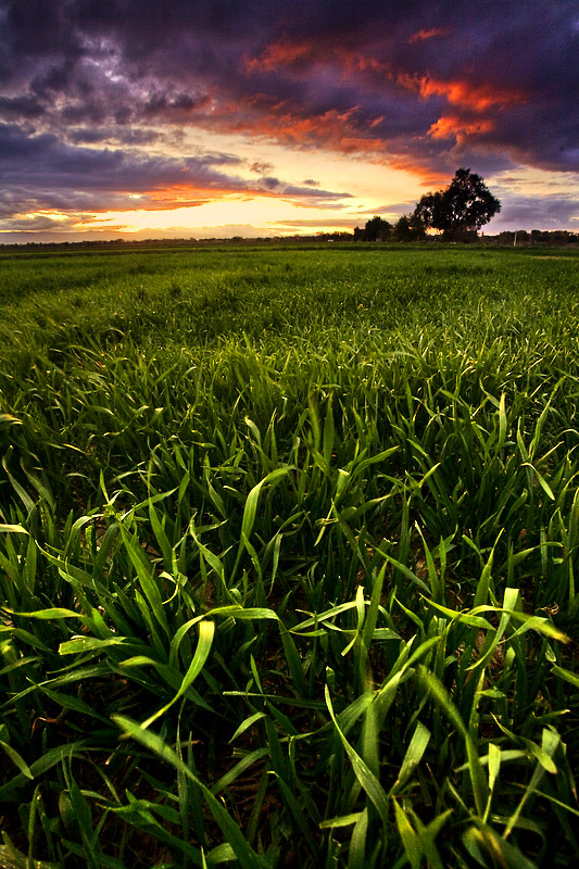
Excellent composition. And lately I've been enjoying the almost over-the-top colors on some color photographs - the colors do work here. Mostly, though, I love those little twists of grass in the foreground - if I reach out, I can feel them!
This made my top10 list of pics. As I was looking I had a feeling the colors were intended to be be shown as such, and I liked it. It's not over the top. Reminds me of those velvia shots. Composition wise, it also strikes a nice balance. If some monitors are set to a too high contrast setting it might look oversatured there? with those folks who voted a 4 ;)
Thanks Mae and everyone else for your comments. I intended the colors to be over the top and I was going for a heavy contrast but probably went a little overboard! I tried an alternate warm toned BW conversion but couldn't get anything that looked good.
Oh, and I did emphasize the dark patterns in the field with a little local dodge/burn :)
Mark, what I find quite outstanding for this photo is that the dark curve pattern in the grass matches the curve pattern of light in the sky which creates a wonderful sense of rhythm in this photo...along with the foreground interest (cool grass). The colors are strong and beautifully purple! However, my only \"nattering naybob nitpick\" would be the tones in the cloud sky seem a bit heavy. Beautiful and lovely photo, Mark!





 Add photograph to your favorites
 Add photographer to your favorites

 Photographer found comment helpful.


