| Author | Thread |
|
|
12/04/2009 06:10:05 AM |
Hey there from the Critique Club
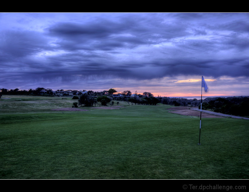
My thoughts on the image: I am not a fan of the post-processing here. It looks like the images you used for the sky were not aligned fully, leaving a repetitive, blurry feeling to the overall image.Even with that, I do like the strength in the colors and the approaching storm you captured.
My ideas for improvement: I'd like to see the golf course area a bit more exposed and brighter. While I am not 100% sure that the overlay is off up top, I think it was. If so, it needs to be properly aligned. If am am mistaken, please accept my apology.
Where I would have/did score this entry: I did not vote on this particular challenge, but this entry would have pulled a 3 or a 4 from me. The relative darkness of the landscape itself leaves room for vast improvements.
Thank you for the opportunity to provide a critique on your entry,
Eric
|
|
 Photographer found comment helpful. Photographer found comment helpful. |
Comments Made During the Challenge  |
|
|
11/29/2009 04:00:26 PM |
|
| Photographer found comment helpful. |
|
|
11/29/2009 11:33:04 AM |
|
Surrealistic looking golf course scene because of the colors. Very nice composition. 10 |
|
| Photographer found comment helpful. |
|
|
11/27/2009 10:40:19 AM |
|
| Photographer found comment helpful. |
|
|
11/26/2009 07:11:05 PM |
|
Great sky nice use of the thirds |
|
| Photographer found comment helpful. |
|
|
11/24/2009 08:08:12 PM |
|
Nice rich blues and greens. The flag movement is a bit distracting. |
|
| Photographer found comment helpful. |
|
|
11/24/2009 11:30:52 AM |
|
| Photographer found comment helpful. |
Theme:
Classic /
Light /
Dark
Home -
Challenges -
Community -
League -
Photos -
Cameras -
Lenses -
Learn -
Help -
Terms of Use -
Privacy -
Top ^
DPChallenge, and website content and design, Copyright © 2001-2026 Challenging Technologies, LLC.
All digital photo copyrights belong to the photographers and may not be used without permission.
Current Server Time: 10/11/2026 10:04:31 PM EDT.





 Add photograph to your favorites
 Add photographer to your favorites


