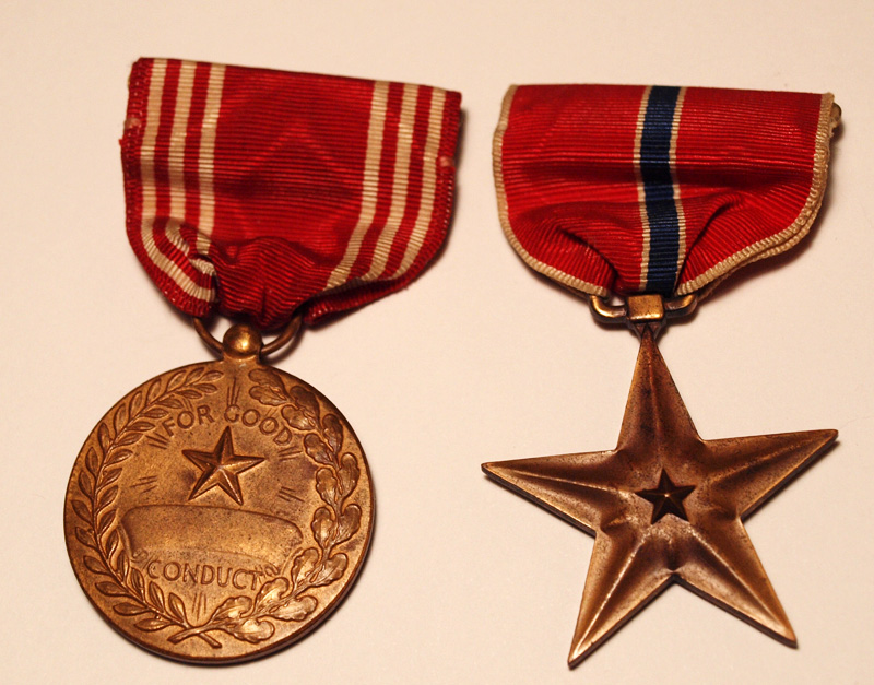
I had a hard time with the lighting, as I couldn't get the glare off of all the angles. I like the off-white of the background. Having a pure white background was too harsh with the medals. I'm not sure if the medals follow the rule of thirds, or if they're in the best place, either. And looking at the left ribbon, it seems out of focus to me, but I can't really tell.
Statistics
Place: 50 out of 63 Avg (all users): 4.9231 Avg (commenters): 5.0000 Avg (participants): 5.0000 Avg (non-participants): 4.9109 Views since voting: 1330 Views during voting: 343 Votes: 234 Comments: 8 Favorites: 0
One of the tricks to glare is actually more light. The reason you get glare is because you're trying to expose for the darker areas of the subject whether you realize it or not. If you give those darker areas their own light you don't have to push your highlights to the max. For shots like these, you might want to make your own little light tent, which diffuses harsh light and spreads a nice soft light all over.
To your comment about the left ribbon being out of focus, it's not really. Your focus is great. The reason it seems that way is because it's out of the Depth of Field. You chose f/3.5 for this shot, which gives you a pretty narrow "DOF". If you were to bring that up to say f/8, the ribbon would be in the DOF also. Keep in mind that in doing that you'd need to increase the amount of light too by one more more ways; slower shutter speed, increased ISO, increased exposure compensation, or simply more light from your light source (gogo light tent!).
And for Rule of Thirds... meh, close enough! Maybe the angle of the left one is leaning too much to the right side? It's a simple straight forward, level shot, so if anyone is complaining about Rule of Thirds, they're probably being too picky. Yes, there is ways to make subjects like this have more impact. You can angle them differently, or lift them off the table and give them a fancy backdrop (hold them to a stormy sky, etc). I see this as a product shot though, and those are generally just as you have it.
Biggest complaint with this photo personally is the white balance. It looks like it should be on a white background, it may not have been. I would put it on a rich colour like a blue, or purple to contrast the medals.




 Add photograph to your favorites
 Add photographer to your favorites


 Photographer found comment helpful.


