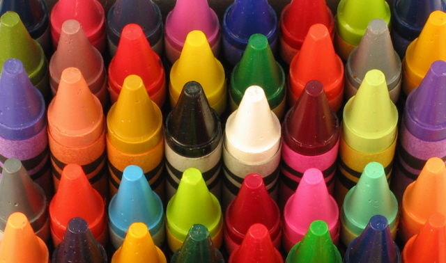
this is a real choice. good focus and dof. the crop is not equal on the left hand side but its a small detail that could easily be corrected. the tonal range of this image is attracting. vivid colors. very clever idea. and also a good test image for your camera.:)
I like the composition of this shot. The centrally placed black and white crayons epitomizes the basic choice. I like the way that a fundamental principle like basic choice is embedded into such an everyday subject. I think your choice to include the entire subject matter in the depth of field was a really good idea.
sadly enough, the colors do not appear pleasing and do not have a lot of "range" maybe oversaturated. the composition and technique is good, but the lighting may be the sinister element holding back the full spectrum- or it may be the limitations of your camera. who really knows? not me.
Gosh, sharp crayons *still* make me want to color! I guess we never quite outgrow that! Good but despite the great color, it's a little boring. Maybe having the rows move in a diagonal across the frame? Or having one crayon missing or worn way down?







 Add photograph to your favorites
 Add photographer to your favorites

 Photographer found comment helpful.


