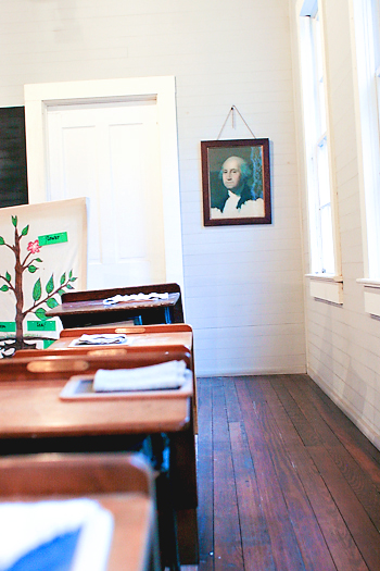
A couple of sugestions. (Sorry I'm being picky, but I think this had potential) 1)Your walls are not strait, 2) the room is very blue - you need to look at the colour/white ballence or use B&W 3)the door and papers on the table are over exposed. 4) the Depth of Field is to small. And lastly the tree diagramme does not seem to have anything to add to the photo and is quite distracting.
Could stand to be straightened a bit and needs a little more contrast. It's a good concept, however, and I like the way the desks, floor, and windows lead the eye to George's portrait waaay off in the distance.
One of the Founding Father's of the nation (George Washington) & school desks speaks of USA being a land of opportunity and learning. Having read quite a few books (from my bookclub) about life in other nations and how little opportunities there are for woman and young girls I appreciate what I have in the U.S. even more. Now your picture conveys the message of open education for all and a land of opportunity...but I have a sneaking feeling that not many are stopping to *really* look at what you are trying to present/say here. The photo is good but I see so much more potential for this. The biggest area that I would recommend to improve the appeal of the image is better use of leading lines and DOF (depth of field). The shot is from a almost straight on angle. If you moved slightly to the left and angled the shot at a 35-45 degree angle to the painting of George Washington I believe you would get the outside line of those desks leading straight up to the bottom corner of the painting. Now depth of field can be best accomplished by a higher aperature setting (usually 8 or better) where the foreground and background are in sharp focus. That means that your shutter speed is going to be slower and thus you will need a steady hand or surface to avoid camera shake. Not easy in low light/indoor conditions but you have the desks there to set the camera on to keep it immovable while the shutter is open and taking the shot. Having the the desk in the bottom left corner foreground in sharp focus will act as the beginning 'path' for the eye to travel on as the line of desks leads the eye to the painting. Lighting is good in this shot so illumination is spot on. One last think to note is be careful with your horizon. The lopsided tilt of the door to the straight angles of the photo itself gives the world a tilted horizon that 'disorients' the viewer.






 Add photograph to your favorites
 Add photographer to your favorites


 Photographer found comment helpful.

