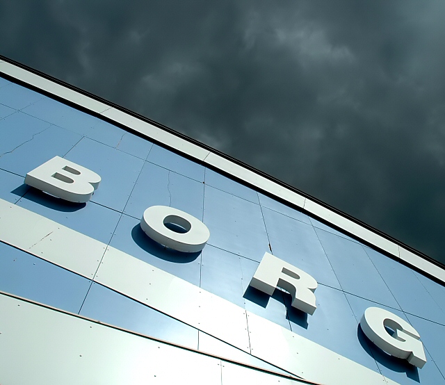
This image creates such a great impact. The colours of the sky are truly beautiful and work perfectly with the colours in the building. The angles and shadows generate a great monolithic impression.
this image was a pleasant suprise. it's nice to have something humorous after looking at page after page of shoes, coke cans, and junk food. good angle, and amazing sky. the shadow behind the letters really accentuates them. 10.
wow - good humour AND an excellent photo. ignoring the high chuckle factor for a moment, i find myself deeply impressed with the image. the sky has been darkened (i assume) quite spectacularly. the blue of the cladding and the whiteness of the lettering also visually appeasing. together sky and building should clash, but they don't. being picky, i might have spent a few minutes cloning out the cracked panel above the "o", and i might have selected the white areas to make a bit whiter (they have a slight shade of green in areas). but those are stupid annoying comments, so 10 it is.
You get a good score from me for the photo and luckily for you I know some pop-culture to recognize the Star Trek reference. I bet you might get voted down for people not knowing what the title means.






 Add photograph to your favorites
 Add photographer to your favorites


 Photographer found comment helpful.


