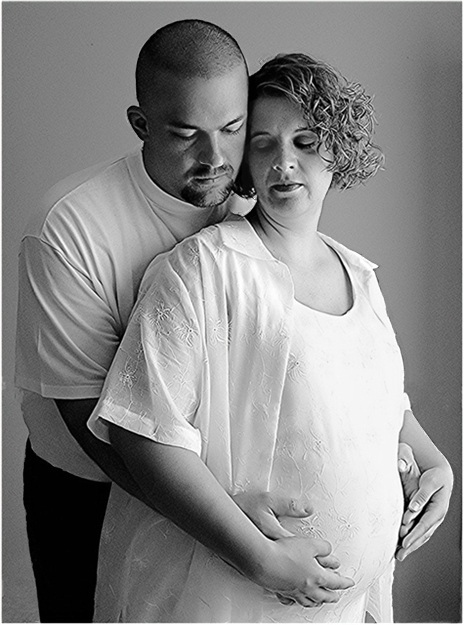
My first attempt at taking any maternity portraits. I'm pretty pleased with them, and the parents-to-be were thrilled. This one struck me because of the expressions more than anything else.
This one had a lot of post processing. Mainly due to the comments I've seen here at DPC...I'm finally trying to anticipate those comments and look closely at the photo myself. This is probably the 8th or 9th "edit" of this shot. I'll try to remember what I did! My photo editing software is "Picture It"...not fancy, so it's different than what you'd use in PS.
1. rotated and saved working copy as tiff.
2. changed the tint a bit and then changed to b/w
3. sharpened
4. worked with b/w levels, contrast, brightness etc. to try and get a good range of b/w tones.
5. cropped
6. cloned out a chair rail and base board and a few small nail marks on the back wall.
7. my first attempt to "dodge" and "burn" a couple of areas. Dodged the front of the dress a bit to try and reduce the brightness. Burned the shadowed part of her face a bit to bring out the features a bit more.
8. reduced, saved as jpg
9. neat imaged. I tried not to make them look "plastic", but I'm not a fan of the grainy look either. Hoperully I found a happy compromise.
10. Looking at it again, I saw some haloing effect in some areas due to the sharpening. I zoomed in and cloned around those areas to reduce that effect.
I'm happy with the final result. Hoping people don't think it's "over processed". My goal is to get a more critical eye for my own work without overdoing the post processing.
Statistics
Place: 222 out of 384 Avg (all users): 5.2239 Avg (commenters): 7.0000 Avg (participants): 5.1090 Avg (non-participants): 5.6222 Views since voting: 1124 Views during voting: 285 Votes: 201 Comments: 7 Favorites: 0
A nicely composed shot, but I would have liked to see her in a shirt that was a bit more form-fitting so you can *really* tell she's pregnant. I would also like to see just a hint of emotion on their faces. The way they are now it's hard to tell if they're happy about this pregnancy or not.
One thing about sharpening is that it makes all the lines of their faces and bodies much more sharp. I think this portrait would've benefitted from softer focus and less contrast -- those would have made the image more flattering, I think.
I have to confess that I like your entry for the Waiting challenge much better than this one. The waiting one really focuses the viewer on the hands and the belly. I understand that most people, when they have photos done obviously want to have their heads in the shot, too :) I guess when I look at this, the hands look too posed, and while I understand that they both are looking at the belly, they both have rather sad looks on their faces which is in big contrast with the joyous event of having a baby. I do like the b&w treatment here, but could also see just a bit of toning work well, it could give the photo a slightler warmer feel. Just my thoughts of course. I've only just started to do portrait photography (well, really just one time) and I never thought it would be as hard work as it was!
This is such a touching image. It shows the beauty of the love between them as well as for their unborn child. The B&W treatment is nice as well. Nicely captured. :o)







 Add photograph to your favorites
 Add photographer to your favorites

 Photographer found comment helpful.


