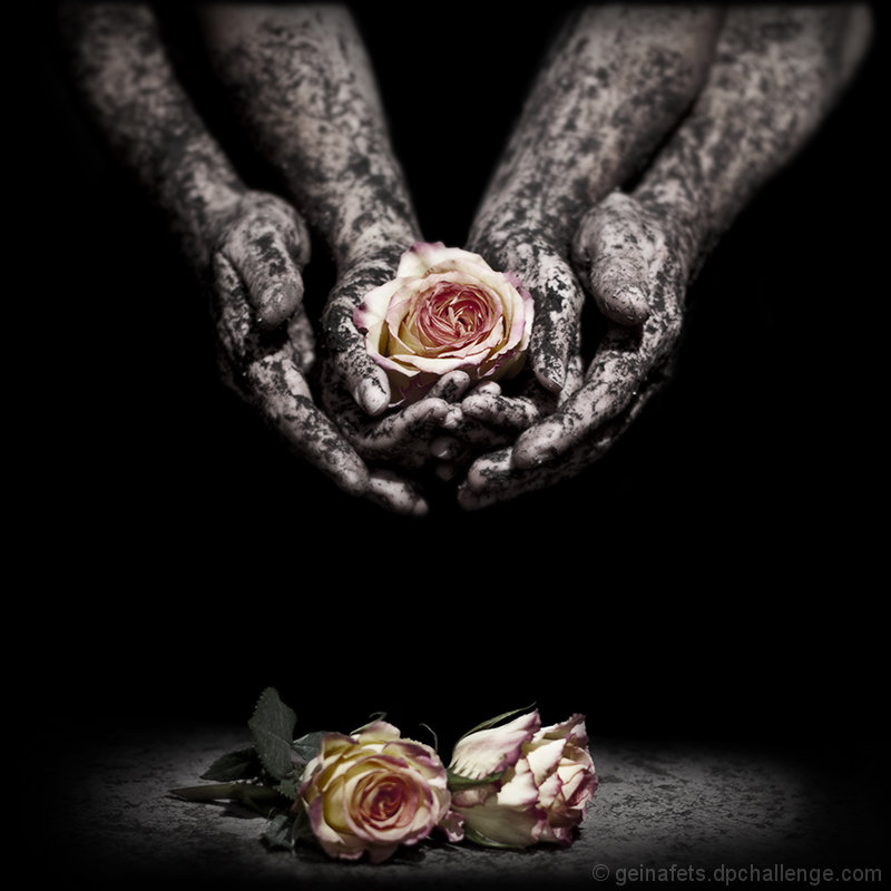
Re-shoot of my "Flower Hands" photo. This is from the same shoot as the photo with the shell. I've already been called on the Joey influence on that one, so I'm curious to see if I get any similar comments on this one.
Edit (CS4):
- Clone out little piece of shirt and pad front person was kneeling on
- Curves to correct skin tone a bit
- Created a new layer and brought brightness all the way down and contrast all the way up (x2)
- Used layer mask to bring back hands, flowers, and part of floor
- Copied blue channel and pasted it into a new layer > dropped opacity
- Sharpen with high pass
- Added two different layers of Gaussian blur, lowered opacity, then brought back the flowers (I think one layer had some blur showing through even in the flowers to make them look like they were glowing)
- Crop
- Resize
- Save
This is edit #5 million. I've asked a few people for opinions and no one agreed, so I hope I chose the right one. Hoping for a second 6+ score, but I know that'll be tough since this is a free study.
Post-Challenge
A few people commented on the OOF flowers on the floor. The hands were slightly farther away from the camera than the flowers on the floor were, so they were naturally OOF. Their leaves were tack sharp, but that looked weird, so I blurred the leaves to match the petals. I purposely shot with the bottom flowers soft, but now that so many people commented on it, I wish I had tried both ways.
One of the other edits I did had less space between the hands and the flowers, but for fear of a DQ, I entered this one without the middle chopped out.
Thank you for all the lovely comments!
Statistics
Place: 41 out of 366 Avg (all users): 6.3487 Avg (commenters): 6.6000 Avg (participants): 6.3148 Avg (non-participants): 6.4318 Views since voting: 1278 Views during voting: 202 Votes: 152 Comments: 13 Favorites: 4 (view)
I echo Ameed's sentiments here. I am astonished to see the low votes. Ah well, nothing to be done about that I guess, each to his own, but this is a beautiful image and I'm sorry it did not score higher.
Ok seriously, Site Councils should invent a way to remotly bunch the a$$holes who gave this picture 1,2,3 and 4.
Man this is one of the most beautiful pictures I've seen lately, the kind of I love to see hanging on my wall,
Don't let any low score put you down .. it is simply wonderful .. very well done,
This feels like it was a carefully designed, set-up, and lit shot. Well captured and presented. But the flower colors don't feel very hopeful to me. Feels more like a lost hope shot.
Interesting. I'm a little weirded out by the pattern on the arms matching the pattern on the floor/table/whatever below. Makes me think of chameleon-like aliens. But with tender hearts ;-)
personally I like the sea shell better...I will be interested in how this does in comparison...and here are my thoughts...less arms shown...closer to the roses at the bottom of the picture...I still really like this alot mind you...
OK, I'm going through the Free Study submissions, purposefully finding those images I think are shot with a less conventional eye - this is one of those images! Thanks for offering something that isn't just DPC friendly eye-candy (though of course there's nothing wrong with eye-candy). I'll be picking one of these images for the Mu (most underrated) award:
Positives:Sometimes this search for the less conventional also yields images that span mass and niche appeal - this is one of those images. This is a very, very well executed image - seriously great lighting, excellent coloration and a great title too. The composition is excellent too.
Critical stuff: Not much, I'm not sure what I think of the slightly blurred lower flowers, but given that the surface is sharp, this must have been an artistic choice.
Overall: A very well crafted image which communicates a vision - I imagine that this is exactly what you set out to achieve. I hope it does well for you. It deserves to.





 Add photograph to your favorites
 Add photographer to your favorites

 Photographer found comment helpful.


