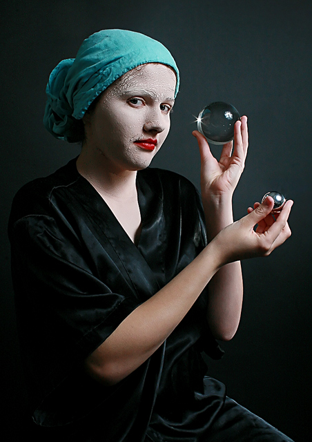
Looks good. The red lips and turquoise headwrap work nicely together. Seems a bit more clear and detailed than the version you previously showed me. I suspect Flickr did the usual oversharpening that it does when it resizes images.(No vote, comment only)
I like the idea here, but it is to clear in the balance of the image that it is a sortof studio setup. Softer light might have worked better. + less on the background and less on the arms. Especially the neck is pretty bright and draws the eye out of the face. Miss some light in the closest eye (bounce it back in with a reflector)
cool shot - love the lighting and the feel of the image, the pose of the model, and how her head and the two glass globes provide a continuation of theme
this has a very classical feel. i really like the small flare off the glass ball. my only complaint is the light reflecting off the pocket in the bottom left corner - i wish it could have been cloned out.







 Add photograph to your favorites
 Add photographer to your favorites


 Photographer found comment helpful.


