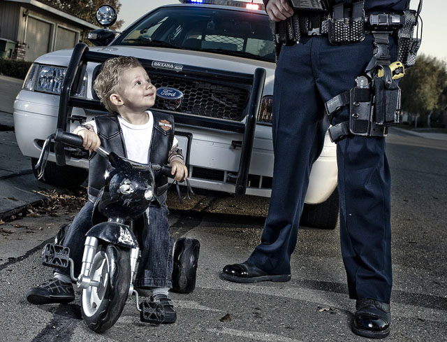
This really how tilt should be used...it's there, but used in such a way that it is not the dominating feature. I think the key is how the officer and boy create such strong verticals.
Anyways, on to the point...great photo, very fun! :)
Very nice theme. Have seen this before so not overly original. However cropping of towering cop and innocent face on "biker" classic, butter wouldn't melt... VWD. 8
Cute picture here, like the details (boys vest, cruiser lights on and other items), good use of thirds. The tilt is more subtle than other entries and looks good.
This is just great - really! I think it has everything going for it. With the right slogan it would make a good greetings card and there are quite a few companies out there asking for submissions...
10
You cannot help but smile when you see this image.
I have seen one similar in the past. It means something to me as well.
I will add, the Yellow X26 makes me smile as well. (I don't think they had them when Norman was with us.)
Added to my favorites, Given a 10 and I hope to see this one on the home page.
I have started a police series and have not been able to work on it much do to shortness of time. I have had this one in mind to recreate myself. I think you did an awesome job..!
Good Luck.
Dale





 Add photograph to your favorites
 Add photographer to your favorites


 Photographer found comment helpful.


