From the critique club;
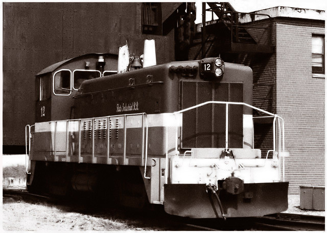
Very nice conposition and the sepia gives it that vintage flavor. The tone and the comp are 7-8. I am a sucker for sepia so I'll give you an 8. The focus point is not the front of the subject and although this is not serious, it shows me very nice detail in the brick wall and the sides of the subject but it leaves the detail in the front a little ambiguous. The eye then follows the white and suddenly drops to what may appear like a picture within a picture. I look and look and can not decipher that lower left rectangle. I can surmize that I am looking underneath the back wall.
Although the above seems hyper critical, the picture does invite the eye and the overall feel is the important chemistry. It is very difficult to find a perfect picture, but here you took great care to keep lines perpendicular to the horizontal plane and it is a rather neat image with impressive contrast. |







 Add photograph to your favorites
 Add photographer to your favorites

 Photographer found comment helpful.


