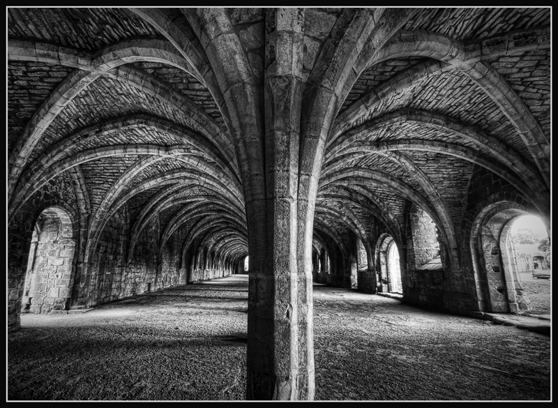
I do concentrate on the structure a bit more in the B&W version. I find that I don't "wander" out to the far right opening in this version. Still, both versions are nice.
B/W for me. In the color version the middle section seems to be more prominent of a focal point. Here my eyes wanders around more, and the arches stand out better.





 Add photograph to your favorites
 Add photographer to your favorites


 Photographer found comment helpful.


