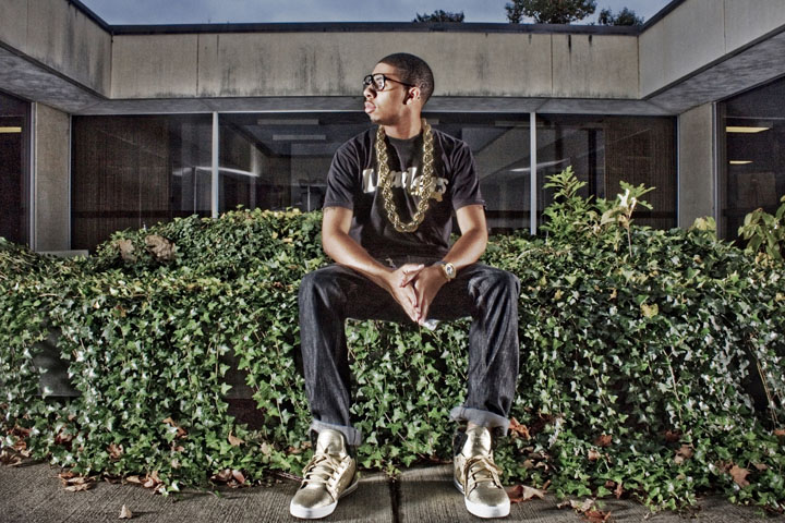
OK, I'm going through the Free Study submissions, purposefully finding those images I think are shot with a less conventional eye - this is one of those images! Thanks for offering something that isn't just DPC friendly eye-candy (though of course there's nothing wrong with eye-candy). I'll be picking one of these images for my Mu (most underrated) award:
Positives: Really bold image - I like the way that you have really committed to it - the composition, the pose, the POV, the harsh lighting, the tone-mapped look.
Critical stuff: There are few elements that detract from the purity of the image and I'm sure you could have cloned them out legally under advanced - for me they are: the strip lights in the lateral windows and the foliage top right. I also think a tad more space below his feet would have balanced the image.
Overall: I really like it, but is so nearly fantastic, that the small distractions become even more apparent. |





 Add photograph to your favorites
 Add photographer to your favorites


 Photographer found comment helpful.


