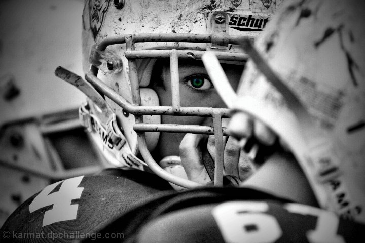
Good, but the desat wasn't necessary, I don't think. The centering and other technicals of the composition naturally lead the viewer to the player's eye.
OK, I'm going through the Free Study submissions, purposefully finding those images I think are shot with a less conventional eye - this is one of those images! Thanks for offering something that isn't just DPC friendly eye-candy (though of course there's nothing wrong with eye-candy). I'll be picking one of these images for my Mu (most underrated) award:
Positives: I love the concept here and you have really captured it in your composition - no question that the viewers eye stays just where you want it. The slight vignette really works too.
Critical stuff: The coloured eye. I can see why you did it but I think you underestimated your image, I am a fan of selective desaturation (I use it myself quite a bit), but this image doesn't need it and I think you have robbed it of its 'specialness' - we focus on this 'gimmick' rather than the photography.
Overall: I hope I haven't offended - this is a really great image, really good photography but for me your editing choice has interfered with what would have been a 9 or 10 for me. I'm going 7 now (a big drop - but I think that is an honest assessment of the impact).
Just the eye is a bit too much for me (reminds me of the sports drink commercials that are B/W except for the sweat). I think this as a simple black and white would be better.








 Add photograph to your favorites
 Add photographer to your favorites


 Photographer found comment helpful.


