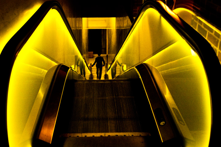
OK, I'm going through the Free Study submissions, purposefully finding those images I think are shot with a less conventional eye - this is one of those images! Thanks for offering something that isn't just DPC friendly eye-candy (though of course there's nothing wrong with eye-candy). I'll be picking one of these images for my Mu (most underrated) award:
Positives: it takes a really good image to carry this acid yellow colouration but you've pulled it off. I think this is a consequence of you using the it with the right subject. It would have been easy to go b&w here but I'm glad you didn't.
Critical stuff: Colour noise is almost always ugly and I think it does mar you image a little - not sure what you could do - I suspect noise reduction would take out some of the image's rawness (and some detail in the steps) and I can't see how a technique I use of selectively desaturating magenta and green could have been done without affecting your colouration. I do wish you'd given us a bit more space at the top - the clipping of the hand rails jars a bit.
Overall: I really like it. |






 Add photograph to your favorites
 Add photographer to your favorites


