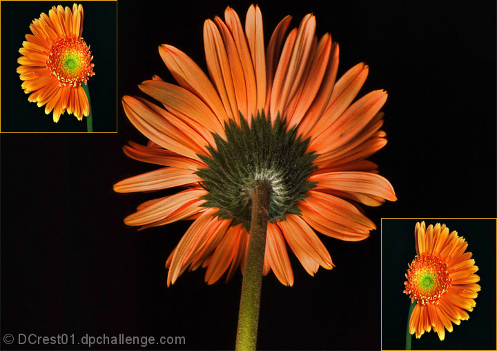
I like the sequence and the lighting on the flower(s). I think the borders should be even, though. The one on the left box on the right side looks thinner than the rest.
like the center image, could be a tad more saturated, though. the duplicate small images doen't match too well lighting- and saturation-wise, it's too small IMO, to. Overall the composition is a bit unbalanced.






 Add photograph to your favorites
 Add photographer to your favorites


 Photographer found comment helpful.


