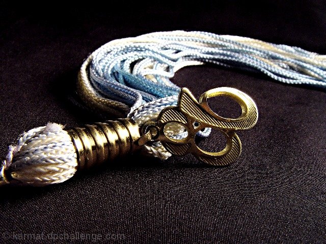
Great shot. I'm just not too sure what the colors of the tassel are supposed to be. They look like bule purple and gold, but faded out. Other than that I really like this. The colors drop it down from a 9 to a 7. Sorry. That's just my opinion. PTL
Looks like a shot from a magazine. A little softer lighting so the detail isn't blown out so much would help, in my opinion. One of the elements that can make a photograph pleasing to look at is the "S" shape, it really works here the way you placed the tassles.
I'm getting some moire (bane of the digital photographer's life) in the bottom right-hand corner. Overall a good idea, well presented, with the focus in the right place.
I think the lighting on the back part is a bit too bright and the "86" is too centered, but those are picky. It's a nice macro even if u don't take my advice ;oP ~indi








 Add photograph to your favorites
 Add photographer to your favorites


 Photographer found comment helpful.


