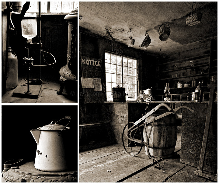
Combination of three images of an open house at Gordon Bill's Station in Ledyard CT. This building is approximately 200 years old and was a general store, 'wait' station, and inn.
Editing: Combination of three images, each edited using basic rule set.
Steps:
1. Imported RAW files using CS4 with adjustments such as clarity, fill, exposure, recovery.
2. Converted to B/W using hue/saturation of single color channels.
3. Resized images to 1280pix, sharpened.
4. USM using large radius for contrast
5. Save for web at appropriate size.
6. Add border and save.
Combined images in CS4
[Oct. 21st, 2009 02:24:02 PM]
The score is quite pleasing. I guess this reminds me and reinforces in me that this little thing called photography is all about capturing the light...
Post Challenge: Thanks for all the great comments and faves. Very much appreciated.
Statistics
Place: 12 out of 149 Avg (all users): 6.5465 Avg (commenters): 7.9231 Avg (participants): 6.6667 Avg (non-participants): 6.4944 Views since voting: 2211 Views during voting: 458 Votes: 258 Comments: 20 Favorites: 6 (view)
This is a really great evocative piece. I love how the image on the right is bisected, creating a feeling of 4 panels, instead of three. Really smart compositions. 9
Fantastic evocative image. I can almost smell the place! Wonderful main shot and the two detail images are perfect. Great b/w processing as well. My choice for the blue. 10.
Absolutely one of the better Triptych's I've seen. Wonderful job of putting together a storyboard with photos! See you on the front page at rollover. :-) Had voted earlier (I was stubborn and gave it a 9)...bumping to 10. Well done!
The slight sepia tones really complement the ol'tyme feel of this photo composition of a general store. One notices the rough feel of the boards, the textures of the place touched by time...I can almost see and breathe in the dust that was kicked up by my intrusion on a place that time has passed by. Love the grouping of items showing off detail of the place in small that you show us on the left. The right panel then shows off the full view of the store - what was once the hub of the place where all transactions must have taken place.
Oh.. .well done! I like all three of these images. I'd have flipped the lower left image horizontally, though, to face into the frame. But, that's a nitpick. (Not voting)
This is fabulous. I love the monochrome tones and the ruggedness of the scene. The shots are all crisp, masterfully lit, and you find your eye easily drawn to all the interesting nick-nacks. All in all, a perfect 10.





 Add photograph to your favorites
 Add photographer to your favorites

 Photographer found comment helpful.


