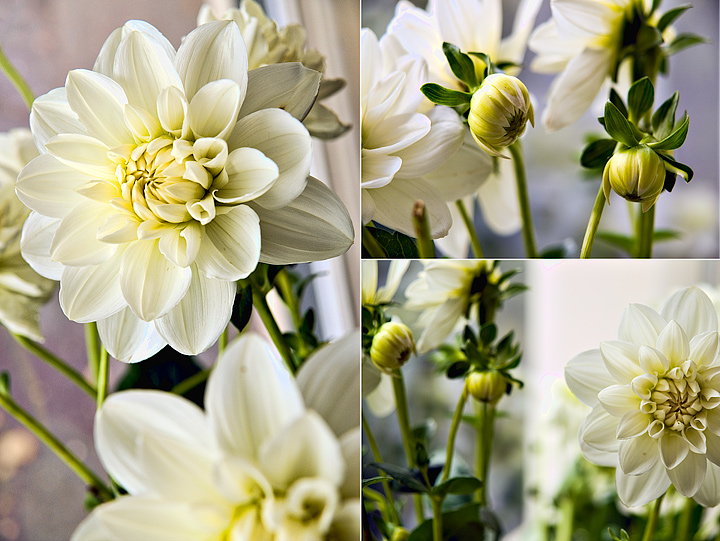
Nice image. Somehow it seems to incorporate a fair amount of "extra" material and doesn't focus in on the primary image. For example, in the left pane, the lower flower is there, OOF and not really contributing much to the shot. Bottom right pane is basically two images - the buds to the left and the flower to the right with a fairly wide mostly white band between the two. Top right is better, but has extra material above and to the left of the buds. IMO, nothing wrong with the shots - just need to "zoom in" on the key idea and lose the "extras". Sometimes more is not better - it is just more.






 Add photograph to your favorites
 Add photographer to your favorites


 Photographer found comment helpful.


