Thank you for the comments. I think they will be very helpful. I did get in a big hurry to get it submitted -- even though I still had plenty of time. I did have a much better shot, but I forgot to turn off the date stamp and couldn't get rid of it! I am just learning Adobe Photoshop so I'm not very good at the editing yet, but with all the help available on this site I can only hope to get better. Thanks again the helpful comments!
>
from the Critique Club:
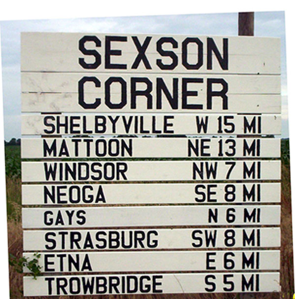
In this picture you presented a few ideas but failed to realize their full fruition. Of course, it is very easy for me to sit back with coffee cup in hand and make these observation. First, the sign ate up too much of the visible image. Of course, a sign can be the sole purpose of an image but in such case great care is given so that the background area compliments it. Smaller would have been better in this case. Second, there is an interesting interplay regarding image and canvas. This effect was left hanging. Again, we are left with a sign and as the eye moves around is distracted by the tilt and a yellow item whose identity is beyond the viewers comprehension.
I think you had a very good idea here, but you did not give it enough thought. The sign robbed the earth and sky completely and the tilt added more question. My suggestion is to rethink this picture all over again. Re-do it, if only to prove that you did have a concept and perhaps because of time pressure or whatever, you failed to realize
your goal. dan






 Add photograph to your favorites
 Add photographer to your favorites


 Photographer found comment helpful.


