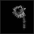
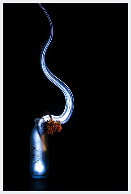
Taken in studio specifically for the challenge. Reduced the exposure a but in LR, then reduced noise, adjusted levels slightly, resized, and added the border in PS.
death :: exit
Statistics
Place: 6 out of 111 Avg (all users): 6.6990 Avg (commenters): 8.2308 Avg (participants): 6.6818 Avg (non-participants): 6.7037 Views since voting: 3198 Views during voting: 374 Votes: 206 Comments: 20 Favorites: 7 (view)
My first visit to the critique club for ages, and I get this. Just my luck. :-)
This is really solid, it portrays your title and is well executed. Execution is excelent with no focus/exposure issues.
From an asthetic point of view the area of light at the bottom of the bottle I think is slightly too hot, and my eyes linger there for too long.
When I first viewed the image I followed the light path down into the bottom of the bottle and totally bypassed the dead flower, missing what I think is the central character.
If that could be slightly darker I think it'd improve the impact of the image slightly.
I'm also feeling that a different crop, or a bit more 'drift' of the soul of the flower to give a slightly more diagonal lead-in to the image might be more compelling, but without seeing it I'm not sure.
Possibly a square crop instead? Same height, pad it out more to the right?
Difficult to find anything else to say about this one.
Not too shabby...well thought out and composed, light and smoke effective. Sharp as a tack, (torch?) light trail well curved and neat and falling away to give dissappearing feel.
While I don't see the blue being your ribbon, I most certainly see a red or yellow. There are only 2 other entries I can see beating this, but this is certainly far better than the rest. I hope you do well...





 Add photograph to your favorites
 Add photographer to your favorites

 Photographer found comment helpful.


