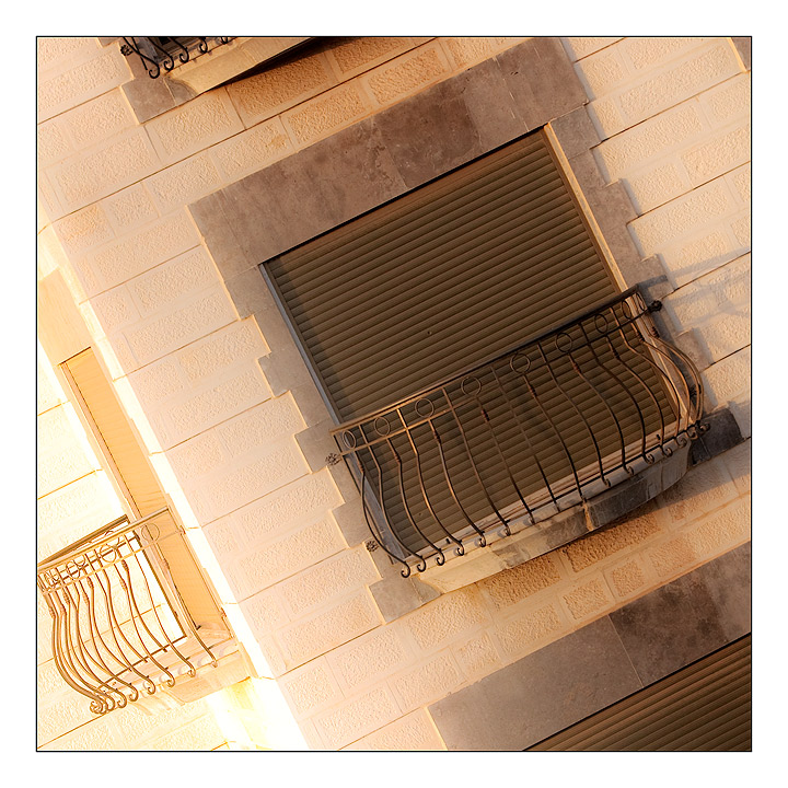
I'm a little nervous that you might be getting hit from people thinking that it's not a view from a window, but a view of a window. I'm a little on the fence about meeting the challenge, but it's such an interesting shot and I love the angle and the balcony around the corner that I say it's close enough!! 8
Although I can very much appreciate the details in the wall you've managed to show as well as the general colour scheme, I'm not persuaded about the tilted presentation which, in my humble opinion, doesn't add much added value to the image.
However, since you've chosen this presentation: shame that some corners are cut. A slight zoom-out would have arranged this (if you didn't crop it this way yourself). But this is only my opinion of course.
Whilst the technical stuff is all spot on - faultless, one might almost say - the subject, the fact that I'm thinking 'why show this to me?' and not finding an answer that makes me want to look longer, is the down-side. That, and the tilt that I'm struggling with comspositionally.






 Add photograph to your favorites
 Add photographer to your favorites


 Photographer found comment helpful.


