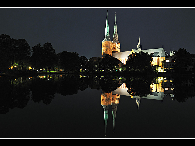
Meets Challenge: 2 of 3. Maybe a little too bright on the surface of the building. Would rather have had you use more edge highlights to give the shape.
Technical: 2 of 3. My only complaint is that the middle part of the building and the right end of the building lack details, they're pretty overblown. Good use of border and fantastic reflection.
Emotion: 3 of 3. The saturation on the building really brings out its purpose, to be a light to those around it.
Awe: 1 of 1.







 Add photograph to your favorites
 Add photographer to your favorites

 Photographer found comment helpful.


