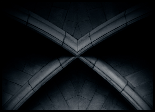
X composition on this beautiful gothic detail is very good. Drenched in blue & black monotone with a cautious natural illumination makes this architectural interesting.........
viewed on a pc with ms ie.
The blue tint adds to the mood. I think it would be better if there were more details in the shadows. Since the light areas are not too light and there is no white point, you might try working with curves to bring up the shadows. The composition is off center just enough to accent the symmetry without becoming static. Overall, the picture looks soft. I feel that a more focused picture would have let the viewer experience the texture of the stone.
You may not be sure, but it sure looks like one of the ceilings in The Cloisters in upper Manhattan to me. Pretty in black and white. X's don't really appeal to me that much but soft focus helps. I'd like to see more detail in the shadows.







 Add photograph to your favorites
 Add photographer to your favorites


