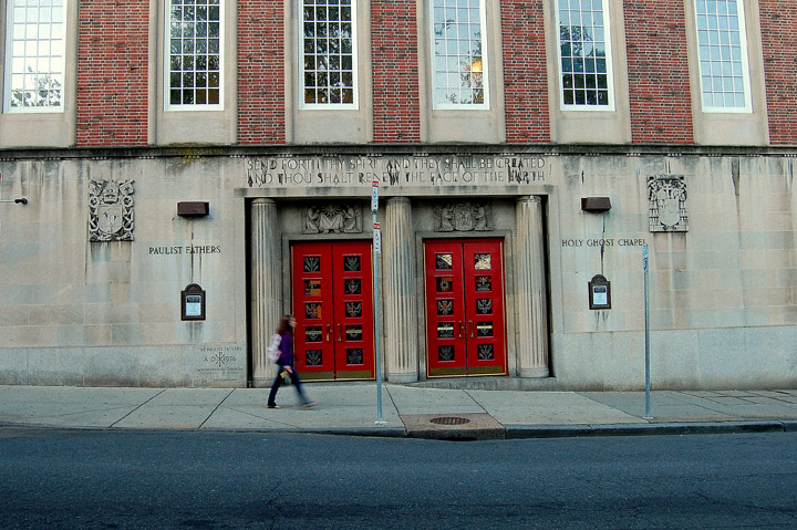
OK, I'm going through the Free Study submissions, purposefully finding those images I think are shot with a less conventional eye - this is one of those images! Thanks for offering something that isn't just DPC friendly eye-candy (though of course there's nothing wrong with eye-candy). I'll be picking one of these images for my Mu (most underrated) award:
Positives: I like this - I think it is the colouration that pulls me in and in that regard the doors are the stars of the show. I'm very much a fan of saturated reds in otherwise fairly subdued colourscapes and this one is no exception. I also like the writing - it adds a context that I would have been curious about. The walking figure is interesting - in one way she is almost irrelevant but try to imagine the picture without her and much of the interest would be gone; that's clever - the use of a small compositional element that doesn't dominate but is nonetheless essential to the image.
Critical stuff: Not too much, I wish you'd compensated for the lens distortion, though I appreciate that you might not have the software so I really mustn't hold that against you...... but I can't say the same for the non-vertical orientation of the doors - given they are the key compositional element, I feel that nothing less than truly vertical will do.
Overall: architecture with a human touch - the walking figure serving to remind us that the built environment is a lived environment. Very nice image. |





 Add photograph to your favorites
 Add photographer to your favorites


 Photographer found comment helpful.


