OK, I'm going through the Free Study submissions, purposefully finding those images I think are shot with a less conventional eye - this is one of those images! Thanks for offering something that isn't just DPC friendly eye-candy (though of course there's nothing wrong with eye-candy). I'll be picking one of these images for my Mu (most underrated) award:
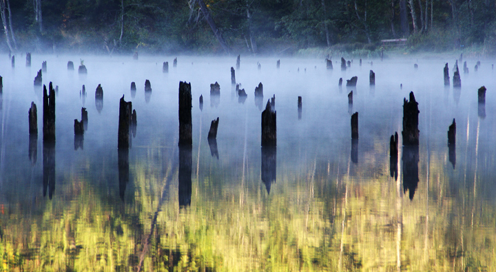
Positives: Brave image - it would've been really easy to go with a monotone image for this but the colour brings a whole other dimension. I really like the way the mist plays on the surface. I also like the POV, it seems quite low which I think really works. Compositionally the image is broken into 3 top to bottom segments, each brings something a little different.
Critical stuff: For me, I always avoid that yellowy green foliage colour - I always tweak it a little darker green - but that just me. I do wonder though, if you'd have done that here, matched the bottom green to that in the top section, would the image have been more coherent? Possibly, but you would have lost the wonderful sense of light that you have in the reflection.
Overall: A really effective image which has offered you a number of choices - going colour has really worked out for you. Good stuff. |





 Add photograph to your favorites
 Add photographer to your favorites


 Photographer found comment helpful.


