|
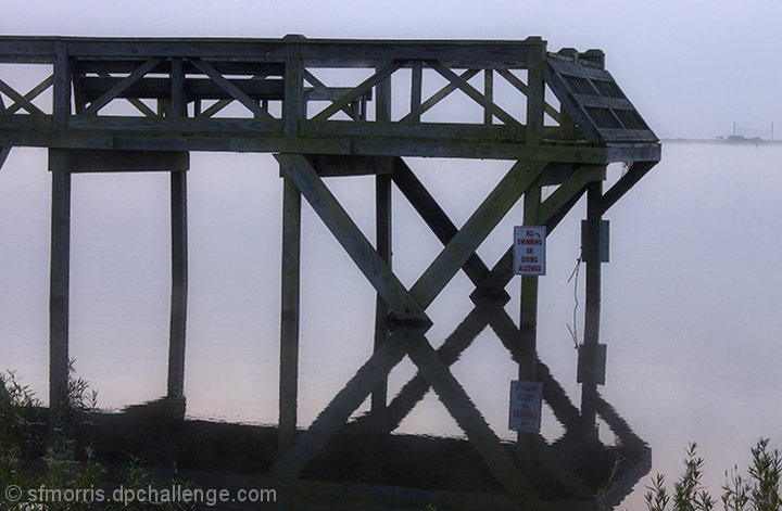
Interesting shot, but it seems dark to me. When there's a sign, you naturally want to read it. So your eyes are drawn to it, and then you notice that it should have been white, and you realize that it would have washed out the water too much, etc. The point is, it ends up being distracting. It seems like either lightening it or silhouetting it might have worked better... -5- |







 Add photograph to your favorites
 Add photographer to your favorites


 Photographer found comment helpful.


