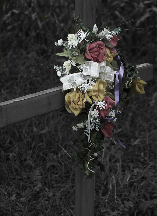
I thought this was an interesting capture and also thought it was quite clever, because I would not have thought to use something like this for the challenge. I like the muted gray tones but I too, would like to have seen some more color pop on the flowers. This is purely based on my own expectation and belief that colors represent life (and happy memories), especially in the type of situation you found here.
The overall gray is perhaps fitting for the mood, but the colors of the flowers should really pop to make this an outstanding photo. It's a delicate balance, and it may not be possible, but I'd rate this as a great idea that didn't quite make it.
It's always sad to see these - I think you've captured this one very well. It looks a little faded but maybe done on purpose. I think maybe just a tad bit more contrast might be nicer but it could just be my monitor. Brightest Blessings...
Nice composition but for an X Challenge it isn't doing it for me. The X part is very dim in the image and isn't really adding anything to the floral arraignment.
I think with a different angle I would have liked this more potentially, but the grass behind it is a little distracting and doesn't really lend to the image at all.







 Add photograph to your favorites
 Add photographer to your favorites

 Photographer found comment helpful.


