Hello, I gave you a 4 on this one. I think, overall, the image is too messy and not appealing enough.
A few suggestions:
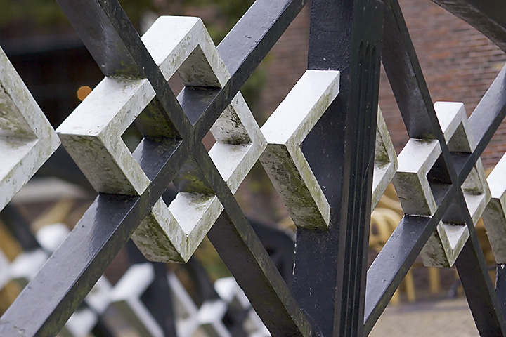
- B&W could have been an better option for this subject, which has to have it more from the structure and lines, then from color.
- A shallower DOF would have blurred out the background more. Now the seats and tables distract from the subject and the don't add any value.
- Emphasizing the symmetry of the subject could have made this image more appealing, for instance by leveling (the vertical pole straight and the center of the white squares horizontally aligned.
Off course: this is just the humble opinion of another amateur ;-)
Hope this helped a bit... |






 Add photograph to your favorites
 Add photographer to your favorites


 Photographer found comment helpful.
