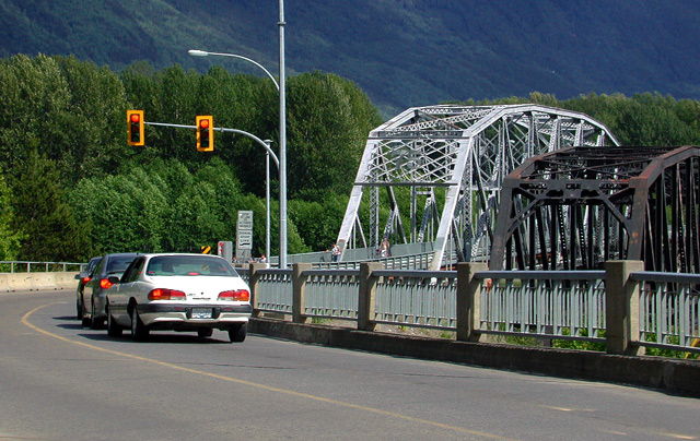
A bit oversaturated- and the funny thing is- the mountain still looks devoid of color.I like teh classic "build the new bridge adn leave up the old" mentality going on here.
The elements are thematically sound, but their arrangement doesn't seem quite right. The one-lane-ness of the bridges is lost. The "message" (red lights) occupies only 25% of the frame. Good concept.





 Add photograph to your favorites
 Add photographer to your favorites


 Photographer found comment helpful.


