Very good concept. The image is flat and either out of focus or blurred due to being hand held at slow shutter speed. The colors are not very complementary either
Another that is on the verge of photo versus graphic art. I'll bet this would have looked cooler in black and white and without the 'vignetting' around the edges. Oh, and a little better focus too.
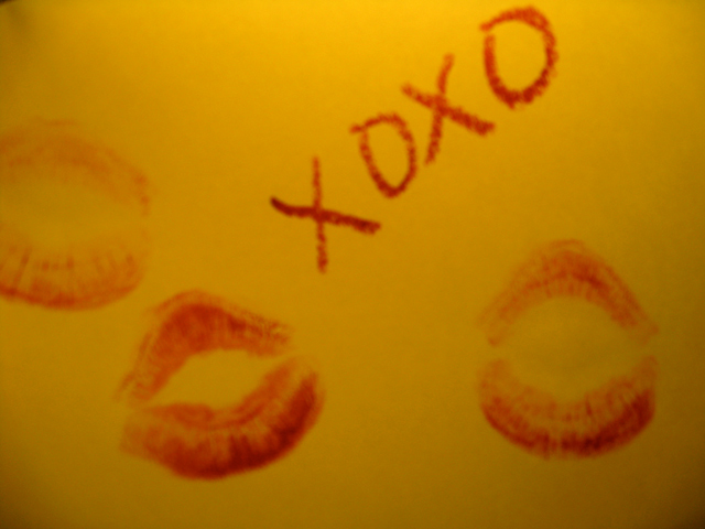
Looks like hand-held in low light and so not sharply in focus. Had it been much more sharply in focus I would have given a lot more points as it is a great idea.





 Add photograph to your favorites
 Add photographer to your favorites


 Photographer found comment helpful.

