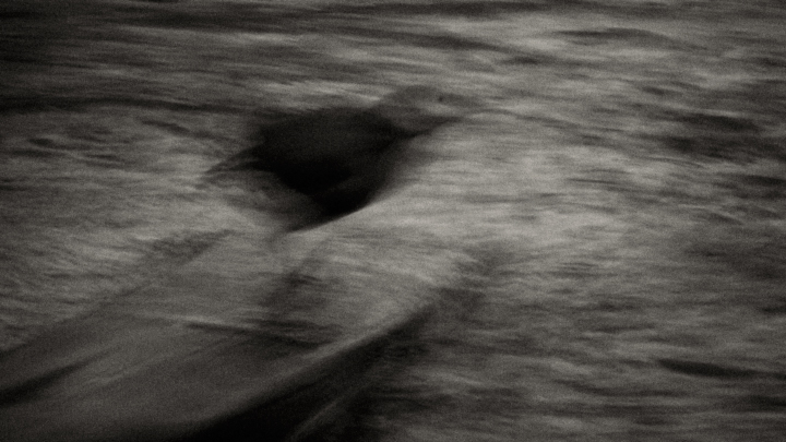
The II is just a working title, the Roman numeral "II" for the second image of a series.
It's refreshing to see though how my lack of creativity appears to have spurred the imagination of some of the viewers.
I can only appreciate the interest.
Statistics
Place: 58 out of 122 Avg (all users): 5.3440 Avg (commenters): 8.1667 Avg (participants): 5.4737 Avg (non-participants): 5.2353 Views since voting: 891 Views during voting: 322 Votes: 125 Comments: 16 Favorites: 2 (view)
Fantastic! I really do like this oddly enough. Well balanced and interesting. Most of the time I say darken the darks and lighten the lights for b/w (s-curve tone), but this works perfectly as is.
I think, if this had more variance in tone, I might like it better. Right now, the shapes provide nothing really. Looks like it could be interesting with just more variation or a hue or two. 6
Slowly the archetype comes into focus, but this is before it comes into focus, because when it comes into focus it stops being an archetype. This is about swimming and flying and being.





 Add photograph to your favorites
 Add photographer to your favorites

 Photographer found comment helpful.


 .
.

