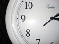
Psychologists could add this to their set of Rorschach test images. Lots of interpretations beyond the font. I would have missed the image being the letter "i" if not for the title.
Without the title, this one would have been completely lost on me. The uneven crop feels awkward and there are some odd color casts and gradients all around the letter. 2.






 Add photograph to your favorites
 Add photographer to your favorites


