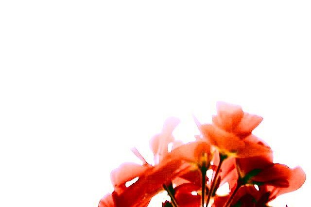
random shot, picked mostly because it reminded me of a particular song, from which the title is drawn. this was actually a difficult decision for me. the other possible titles were "the smell of sunshine (i remember sometimes)" or "in the blur of serenity." points if you know the song. contrast/brightness, gamma, saturation/channels, and a histogram function or two modified slightly in post-production, and it was sharpened slightly, and cropped to 640x427 instead 480.
Statistics
Place: 277 out of 301 Avg (all users): 3.8413 Avg (commenters): 4.8000 Avg (participants): 3.7293 Avg (non-participants): 4.0667 Views since voting: 1982 Votes: 271 Comments: 14 Favorites: 0
I realy like this photo, the only nit I can pick is the slight purple fringey effect on the upper left edges of the petals, you may have done it intentionally, but it reminds me of chromatic aberrarion. I would have tried pushing it all into reds/oranges. Right now it looks kinda low tech, and purer reds might help legitamize the deliberate blow-out and softness... I am always surprised when people can't just let vagueness and softness please the eye as it is.
I think that the shot is pretty creative... nice way you did the background.. but, in my opinion, maybe try cropping it a bit so that the flowers fill more of the screen? just a thought though.. but im surprised at the score it recieved.. i think it should have been higher
i'd just like to comment in response to a few comments i received.
po: i did not cut and paste anything. this is a photo. i will show you the original if you like. the background was sky, which was so bright in contrast to the flowers that camera captured it as white. cutting and pasting would be illegal. the only cut was to remove the top 53 rows of pixels to bring it down to 640x427
the blown out effect was intentional. i liked it in the original, so i played with the contrast etc to accentuate it. same with the colors.
yes. it is supposed to be lacking detail, have bright colors, lots of negative space, and be a little of the fuzzy side. thank you for noticing.
if anyone is interested, the title and inspiration came from a song by nine inch nails called "i'm looking forward to joining you, finally"
Way toomuch empty space for me personally. Also too much of the flower out of focus and too bright on the very top of it. This is just my personal appeal. This is probably what you meant to do, and being new that I am it doesn't appeal personally. Sorry. But I will give at a 4. PTL
There's something about this that just grabs me. I love that it takes up so little of the frame. That balance and watercolor effect it has. I like ! Shiiizzzam







 Add photograph to your favorites
 Add photographer to your favorites


 Photographer found comment helpful.


