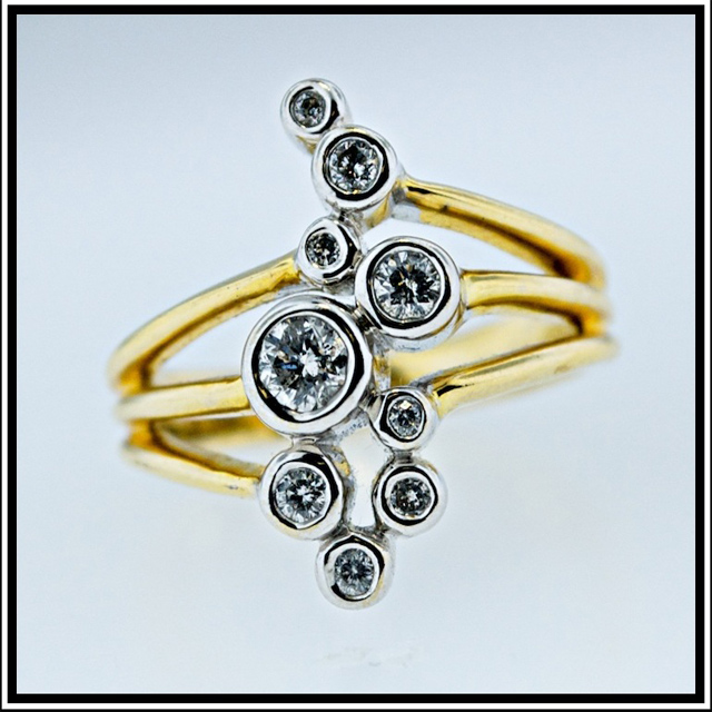
Lightbox lighting. This shot would have been much easier with a macro lense instead but could not get my hands on one. I was lucky the ring had 9 diamonds!
Statistics
Place: 81 out of 165 Avg (all users): 5.2979 Avg (commenters): 5.6000 Avg (participants): 4.8421 Avg (non-participants): 5.4962 Views since voting: 1159 Views during voting: 352 Votes: 188 Comments: 7 Favorites: 0
I didn't actually vote on this image (I only managed 20% in the 9 challenge) but had I done so I would likely have given it a 5/6.
I do like the subject and the composition is great. The centered composition with a square crop was certainly the best way to go with this one. The depth of field was a good choice.
For me though the lighting seems a bit flat. I think you could likely have corrected some of this in post processing. I dragged the image into Photoshop CS3 and noticed that an adjustment (using Adobe Camera Raw) in the white balance settings brightened the image up a lot, made the background whiter (without having to adjust exposure, brightness or levels) and overall the image had a bit more depth.
I also agree with Ericwoo about the border, I feel the black doesn't enhance the image at all.
Still, overall I think it was a nice idea that fell a bit flat in the execution.
Thanks for the suggestions guys. I would love to learn more about how to get diamonds in particular to show up better under lighting. If anybody has any tips I would greatly appreciate them. There are a number of challenges I noticed taking this shot:
1. each dimonde based on the cut or the way it was set will reflect light at different angels.
2. If the lighting is head on, you run the risk of a "black inside" where the light gets trapped in rather than reflected
3. balancing the lighting to get a consistant picture of all the diamonds is a lot easier said than done.
Wonderful depth of field. I love that you chose a cyan background to complement the gold, but I think I might have made it ever so slightly more saturated.
I like the idea, bu the execution seems to be a bit lacking. The shallow depth of field works well for the image, but the muted colors detract from the pop and sparkle that the image should/could have. Your border also takes away from the overall quality of the presentation. I like a clean, thick, white border with a small, 1-2 px back line separating the image from the white border. That's all a matter of personal preference, but a clean look would have served this one much better. I like the square, centered composition. It plays nicely with the symmetry of the subject. I am going to go 5 here, but there is tons of room to grow this vote.





 Add photograph to your favorites
 Add photographer to your favorites

 Photographer found comment helpful.


