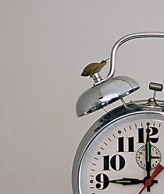
This is one of the more interesting of the many, many clocks in the challenge. I do appreciate your added creativity and titling here. I like the point of view you chose and I almost like the composition. I think that this one would have worked even better as a square. There is something off about the overall image quality, though. The focus seems to be on, but not crisp. I see a lot of haloing around the image elements. Still, nice creativity that I will score a 5.





 Add photograph to your favorites
 Add photographer to your favorites


 Photographer found comment helpful.


