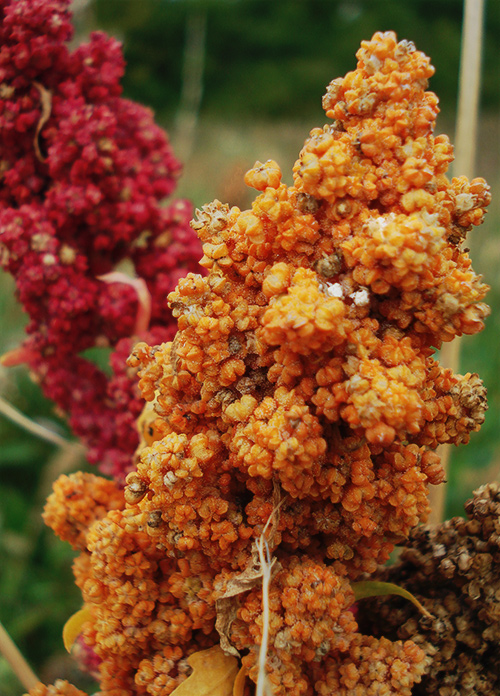
1st attempt at tone mapping to see what would happen. I actually followed the instructions a little bit wrongly on this one but I like the contrast on it.
I like the earthier, richer color in this one much better than the other. Although I'd be interested to see if a slight levels adjustment would brighten it up a tad and give the colors a little more pop.
I inverted the under exposed layer wrongly & then played around with the layer types. Think I changed under to darken & over to difference. I think the tutorial is a good starting place for a first time and playing with the results is definitely interesting :)
Yes, like this one much better. I don't know anything about tone mapping, but this image looks "richer". The colors of the foreground flower, the background flower, and the background itself is "deeper".
Whatever you did, it worked well. It brought out detail and gave this a lot of visual pop, but without the cartoony effect that most associate with the treatment.




 Add photograph to your favorites
 Add photographer to your favorites

 Photographer found comment helpful.


