|
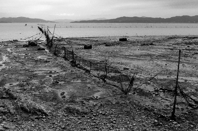
I have written comments on almost every entry now, and many of them goes something like this: "I'm having a hard time seeing the relevance". The conversion is good, but in Heidastyle it apears to be a bit "weak". Much more contrast to be a Heida b&w (in my oppinion), or a more desaturated look (play with the saturation slider if you have one in your editing software) and you¨'ll know. The grain in this fits perfectly, it's just that I'm not sure about the toning. |






 Add photograph to your favorites
 Add photographer to your favorites


 Photographer found comment helpful.