I find the thick horizontal stem is slightly distracting to the overall feel of this photo. It should have been removed or cropped out. Details are very good and lighting and contrast are also good. Sky shows some compression but not enough to subtract points. Border is a bit too thick for my tastes. 7
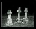
Pretty nice sense of depth. The cross looks a little too far tilted to the left. I might have tried rotating the whole thing to the right to balance it, even if the flower would then be tilted. Should have removed that dead stem in the foreground. I would have also pulled out a pair of sicsors and clipped those tall pieces of grass. OK maybe that's a little too much. :)








 Add photograph to your favorites
 Add photographer to your favorites


 Photographer found comment helpful.


