sorry bad composition, boring and where the zork is the back to element ? sorry that sounds a bit harsh but people are crying out for comments. At least its well exposed.
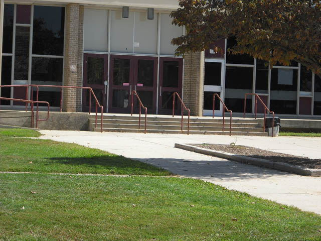
Looks like an average snapshot, I'm afraid. A couple of things that could help:
-A stronger perspective view, using a rule of thirds composition.
-Correct the slight tilt
-Image looks flat, some levels or curves adjustments can fix that.
-Some people in the shot could give it some more interest.
A model carrying a backpack heading for the door might have added a lot to this shot.
While it meets the challenge it's uninteresting to the viewer. Perhaps getting closer to the doors (which presumably are your subject) would have given you some more creative options. Also if this shot were taken early or later in the day you would have gotten more interesting lighting - it looks like this was taken mid-day so you get the doors in shadow and the uninteresting shadow of the tree in the middle of the picture.
I like that you tried to convey the meaning of the challenge and in a lot of ways yours met the challenge better than many people.





 Add photograph to your favorites
 Add photographer to your favorites


