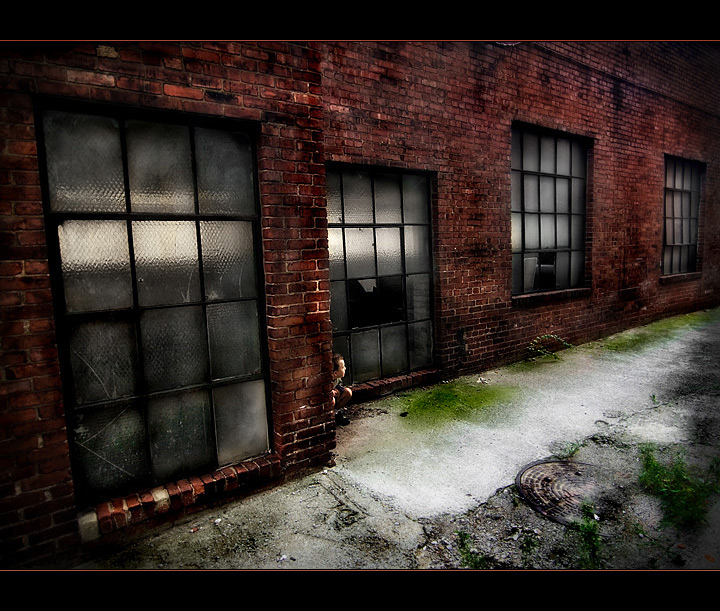
I almost didnt enter this. I figured that he wasn't really hiding in the shot like many people would prefer. He actually stands out pretty prominently IMO. However I got a $25 parking ticket for not feeding the meter at 8:30am on a Saturday morning (was away from the car for no more than 10 minutes). So I figured I paid for the shot I might as well enter it.
Was in the 7's early on. Can't complain about this score at all. Might squeeze out a top 5. Doubt it will ribbon. Really low vote count is always a bummer on an entry taht is scoring well. Really thought more people would be voting. Oh well. Looking forward to rollover.
-----------
Post Challenge - Whooh hooh! Another ribbon of my boy. We had fun in the alley downtown and the ribbon makes the parking ticket not so painful.
Looking at the breakdown in this challenge it worked out that my 5 highest scores given landed in the top 6 of the challenge. Had a couple of other 8 scores fall lower but 5 of the top 6 is interesting.
-----------------------------------
Ok - so there seems to be a desire to know the editing steps involved here. I dont remember all of them specifically but I can share the general gist of my workflow. The above picture is the converted RAW image with no tweaks done to it.
First thing I did was convert in Lightroom with some basic steps - probably a direct positive and some minor tweaks. After conversion I did a crop and a slight Skew tweak to help straighten up the wall corner by my boy. I then ran an action called Super Fun Happy (from the totally rad action site) and did some tweaks on each individual layer (reduced opacity on the saturation and warmth layer and the main layer to bring back the sharpness, plus a bit of paintbrush work on the lighten and darken layers (if you dont have this free action I would recommend checking it out - I use it often to varying degrees). Next was a Bitchin' b&W action (from the same site) then shifted that layer to soft light and reduced the opacity. This gave me a more appealing contrast and color tone. There are several selective color and hue/sat tweaks to adjust the reds, remove the blues and darken the blacks. Dodging and burning galore as well as some spot desat on the windows. USM in the large version followed up with a faded USM in the resized version. I believe a paint brush set to color or something to match up the color of the wall on the right side to be similar to the left. Finished with the border.
I need to set PS to record my history proper so that I can give more detailed info. Needless to say I use many layers and many many duplicate tools (dodge, burn, sat/desat, selective color). Hope this helps those who are interested.
Statistics
Place: 2 out of 73 Avg (all users): 6.9048 Avg (commenters): 7.3636 Avg (participants): 6.5000 Avg (non-participants): 7.0426 Views since voting: 7865 Views during voting: 367 Votes: 126 Comments: 42 Favorites: 7 (view)
Thank you so much for sharing your processing information! I love seeing originals, learning how you processed and visually seeing the magic that can be created in post processing if you are talented and have the skills. Now I'm going to go and look for that Action site!
Intriguing photograph, nicely grundged and gritty! From your description of the editing steps this was not a simple accomplishment,...
Thank you! And while the process wasn't "simple" it was alot of fun. I truly enjoy seeing where an image can go and sometimes taking the longer route to get there is half the fun. Many times in my work I don't necessarily have an end product that I am looking for. I just kind of fumble my way through.
Intriguing photograph, nicely grundged and gritty! From your description of the editing steps this was not a simple accomplishment, but I'll bet that Topaz Detail would have provided a very similar effect with just a couple key and mouse strokes. Of course, you would have use a Topaz compatible image editor! Congrats on a well earned ribbon!
Thanks, greatly appreciated! I don't use to use Photoshop, even having it available here... I'll try the actions and see how they come... But still I find that I can get same results on PSP X2, I really enjoy it much more than Photoshop.
I liked this shot from the get go. It's not only the processing but the child's pose and angle from which we see him. The space all around him makes him look smaller than he is and adds to the feeling of being lost that I get when I view this.





 back alley
 Add photograph to your favorites
 Add photographer to your favorites


 Photographer found comment helpful.


