I just realized my suggestion of selective noise reduction would be a no-no in this basic editing challenge. However, if your noise reduction program works in the right manner, you can apply it to a specific color range, in this case cyan and blue. Here's how I do it in PaintShop Pro to smooth out the sky without hurting the rest of the scene:
Hmmm, ok. I do have PSP in addition to my other programs. I'll have to try my hand at your advice. Thanks for the screenshots Steve. Very helpful indeed!
I just realized my suggestion of selective noise reduction would be a no-no in this basic editing challenge. However, if your noise reduction program works in the right manner, you can apply it to a specific color range, in this case cyan and blue. Here's how I do it in PaintShop Pro to smooth out the sky without hurting the rest of the scene:
Thanks for you vote Yo Spiff. For some reason I didn't realise the noise in the sky until I had already submitted it and went back to look at it. Too late for DPC, but I did fix the sky when I uploaded this to my Flickr account. Looks better. Oh well...I will keep plugging away.
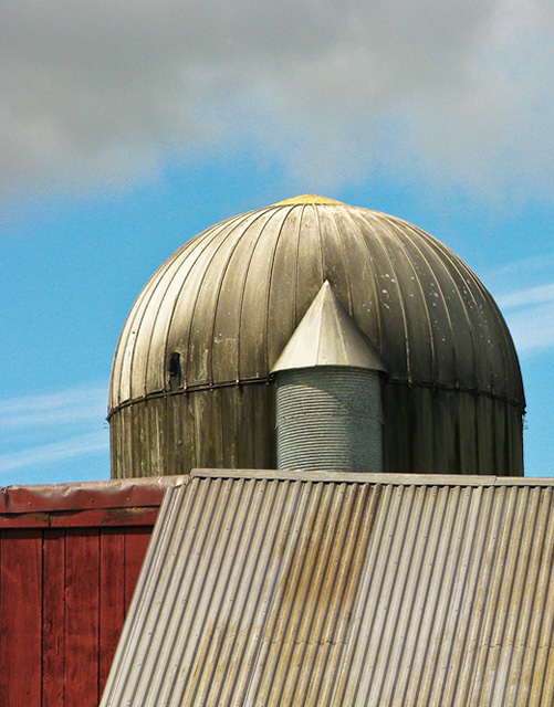
Another placement where I disagreed with the mass appeal. I really like these shots that I call "semi-abstract". You can easily identify what they are, but they concentrate the viewer on the shapes, colors, and details, rather than the object as a whole. I gave this a 7.
Perhaps some selective noise reduction could have helped with smoothing out that sky a bit. The S5 has a lot of great features, but it isn't the most silky smooth camera out there.
I think this would make a nice black and white with a red filter. Not sure if its an optical illusion with the line or if the orientation of the entire image is lower on the left. but I might have brought re aligned slightly to level the dome. All in all nice shot.
This is SO close to being really 'good' that I've got to make a suggestion.
So much of your interest is in the structures that the sky - even though
it has that nice cloud - is getting in the way of the composition. I like
your post processing; the bright red is a nice foil for the nicely
modeled and textured browns.
Okay, that and 2 cents will get you a down payment on a cup of coffee. Good
luck on the Challenge. (6)







 Add photograph to your favorites
 Add photographer to your favorites


 Photographer found comment helpful.


