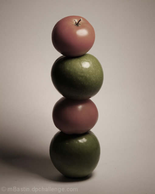
I'm not very good a set up shots, i've never really done any before so i'm not sure about this picture. It was much harder to stack then it looks haha.
Btw i am so annoyed by those 2 specks (one to the left of the bottom apple and one to the right) but theres nothing i can do i guess. hope people don't judge too harshly because of it.
nothing special with editing:
crop
desaturate
levels
hoping for the best.
Statistics
Place: 49 out of 56 Avg (all users): 4.4785 Avg (commenters): 5.1250 Avg (participants): 3.8929 Avg (non-participants): 4.5823 Views since voting: 813 Views during voting: 323 Votes: 186 Comments: 10 Favorites: 0
I had thought this was an intentional desaturation. the other aspects of the photo were done well enough that I was pretty sure you meant it to be that way. I suspected the look would not go over well. I gave it a 6, however.
yeah i was unsure, i wanted it almost completely desaturated with a slght duotone, and my friend though it looked good saturated. so i thought i'd compromise and slightly desaturate it ( because that sounds like such a grat idea right? lol) i regreted it almost right after i submitted it but it was too late because I submitted it last minute.
Once i get a membership i'll upload the one i liked to do it justice because i like the picture, just not colour. thanks for the comments though.
I had thought this was an intentional desaturation. the other aspects of the photo were done well enough that I was pretty sure you meant it to be that way. I suspected the look would not go over well. I gave it a 6, however.
It's very dark. With the red and green apples, were you going for this muted approach on purpose? I would have liked to see more intense or saturated colours and contrast between the reds and greens. I also think using the rule of thirds would have made this a more successful image (having the tower built on the right hand side, for example).
It's very nice, but it also seems dark and for such colorful food, the colors are extremely muted. Did you try playing with levels and saturation? I making the colors more natural would help quite a bit.
It's too gray, I'm sure you were going for something but it makes it dull and gloomy looking. Good idea although I think bright vibrant colours make fruit and veggie pictures more appealing.
not sure about the colours, I think complete B&W would have worked better - red tomatoes are so cliched that slightly red looks washed out a bit. LIke the construction though






 Add photograph to your favorites
 Add photographer to your favorites


 Photographer found comment helpful.


